Blog Archives
Fun Blends: Terracotta Army Chocolate Pu–erh
My wife, Kathy, is a chocoholic who loves tea. She has tried chocolate tea blends from various companies, and decided that she’s not a fan of chocolate tea blends using mild-flavored tea. She likes to be able to taste the chocolate and the tea.
Gwen and Kathy and I experimented and came up with a blend based on a loose-leaf shu (ripe) pu-erh blended with cocoa nibs and vanilla. It was a struggle getting the balance just right, but the result was so good, we decided to give it a permanent home on the tea bar’s menu. After struggling for a while to come up with a name reflecting its Chinese origins: Terracotta Army Chocolate Pu-erh.
The Logo
I love having fun with tea logos. As I’ve mentioned before (see list below), a series of local artists have been creating logos for our house blends. This one was produced by artist (and art history professor) Kory Rountree:

We love that Kory started with one of the soldiers in the real Terracotta Army, made him chocolate, and gave him a cup of tea. He actually provided two logos for us to choose between. We picked the one above because it is clear, simple, and easy to identify even at small sizes. I actually prefer the alternative (shown below), but it’s just too complex to put on a little tea label.

The details are what really make this one. Note the eyes on the soldier above and left of the chocolate soldier. You can almost hear him thinking “Yummy!” The one above and to the right has a similar, but more subtle expression. It’s not obvious at first glance, but if you look closely, the soldier to the right of the chocolate fellow is holding a piece of the melted/broken chocolate arm in one hand, and a cup of chocolate pu-erh tea in the other.
Thank you, Kory! Another awesome logo for the collection!
This is the latest in a collection of labels I’ve written about here before:
Fun Blends: Fifty Shades of Earl Grey
At the height of popularity of the Fifty Shades of Grey books, we still owned a combo bookstore and tea bar. I was working on some Earl Grey recipes, and thought it would be fun to do a Fifty Shades parody since the books were still selling well. It was just for fun, and I didn’t think it would earn a permanent spot on our tea menu, but this odd blend became one of our top sellers.
DISCLAIMER: There is no connection whatsoever between this tea and the Fifty Shades of Grey books. This is not a licensed product, and it has not been endorsed or authorized. It is strictly a parody.
The tea is based on a Kenyan black tea with a bit of Ceylon and purple tea mixed in. Then, of course, it gets the bergamot oil that characterizes an Earl Grey—a lot of bergamot. On top of that is a melange of cinnamon, orange, lemongrass, cornflower petals, and other goodies. Some of the ingredients were added for flavor, and some for looks. I wanted a black & blue tea, and I wanted something with a dominating flavor. What can I say? I just couldn’t resist the wordplay.
Coincidentally, it’s certainly one of the prettiest teas we have. People couldn’t resist the tea shot through with color, especially the cornflower petals, which added nothing whatsoever to the taste.

The Logo
After a variety of local artists had been having the fun of producing logos for our house blends, I thought it was about time to do another one myself. Since drawing isn’t my strong suit, I decided to pick a blend where I could work from a stock photo to start, and Fifty Shades of Earl Grey would be a good one to start with.
For the background picture, I wanted to capture the feel of the book cover artwork without using any of their imagery. I found a stock photo I liked, clipped out a portion of the pot with the steam, extended the dark background, and then adjusted the tone to get that bluish-grey color we ended up with. For the text, I chose a typeface with the look & feel of an old typewriter font, but proportionately spaced, and then I kerned it to suit.
The tagline at the bottom? Well, once again, I just couldn’t resist.

Fun Blends: Coyotes of the Purple Sage

With new tea blends, sometimes we come up with the tea first and struggle to think of the perfect name. Sometimes we come up with a cool tea name and then spend weeks tweaking the formula until we find just the right taste. And then the logo works its way into the equation.
Sometimes, however, everything comes together in a flash, and that’s what happened with this tea.
We were looking for ideas for a fundraiser, using a tea that had a real American West flavor to it. Being a tea bar/bookstore combo, a literary allusion makes things even better. As we were throwing out ideas, someone said “Zane Grey.” The next obvious leap was “a Zane Grey Earl Grey.” The next obvious leap was to Zane Grey’s best-known book, Riders of the Purple Sage.
The ingredients for the tea came together pretty quickly as well. Black tea and bergamot oil are the base for most Earl Greys. Sage was pretty much a mandatory ingredient. A bit of lemon verbena and lemon thyme added more citrus notes and the thyme goes well with the sage (I will resist breaking into song here), and a subtle touch of peppermint finished off the blend.
The Logo
The fundraiser is for the Yellowstone Wildlife Sanctuary here in Red Lodge, and two of the well-known noisy critters right by the entrance are a pair of coyotes named Bonnie and Clyde. We wrapped everything up by tying in the Wildlife Sanctuary and naming the tea Coyotes of the Purple Sage.
My logo is an homage to the cover of the first copy of Riders of the Purple Sage that I read, shown in the banner at the top of this article.

The Lady Greystoke logo

Does it seem like I’ve got a theme going on this blog lately? I’ve had quite a few posts about the fun we’ve been having with logos for our house blend teas. Some great artist friends have done logos for us, including Al Jones (Hammer & Cremesickle Red Tea and Robson’s Honey Mint), Brandon Pope (Mr. Excellent’s Post-Apocalyptic Earl Grey), and Suzanna Bailey (MaterniTEA). Now, I’d like to introduce the latest in the series: Doug Bailey (Suzanna’s husband) made us a logo for our Lady Greystoke tea (the story behind the blend is here).
As with the other artists, I didn’t give Doug any direction at all beyond explaining the origin of the name and the ingredients in the blend. He picked up on the “wild yet civilized” aspect of Jane Greystoke, and being Doug (his nickname is “the Beerbarian”), he added a saber-toothed tiger. I don’t remember any saber-toothed tigers in the Tarzan books, but that’s probably just because Edgar Rice Burroughs didn’t think of it.
Doug is a pencil kind of guy, so he gave me the logo as a pencil sketch and I colorized it. I’ve always done my colorizing by scanning the image, loading it into Photoshop, making the background transparent, and then painting behind the image. This has the disadvantage of taking out light shading and fine detail from the original sketch, and Doug did a lot of shading in this one.
This time around, I added the color by creating new layers for each element (16 layers in this case) and setting the layer to a linear burn. That way, I don’t have to modify the original layer at all, and any shading—no matter how subtle—shows through the color.
As an aside, I’ve always preferred to drink my Earl Grey teas hot. I got to thinking about iced Earl Grey today when a customer ordered an iced Lady Greystoke at the Tea Bar, so I had to give it a try. The addition of the lavender, rooibos, and vanilla really seems to make this a smooth iced tea. I may be drinking more of it iced.

Fun Blends: MaterniTEA for Morning Sickness
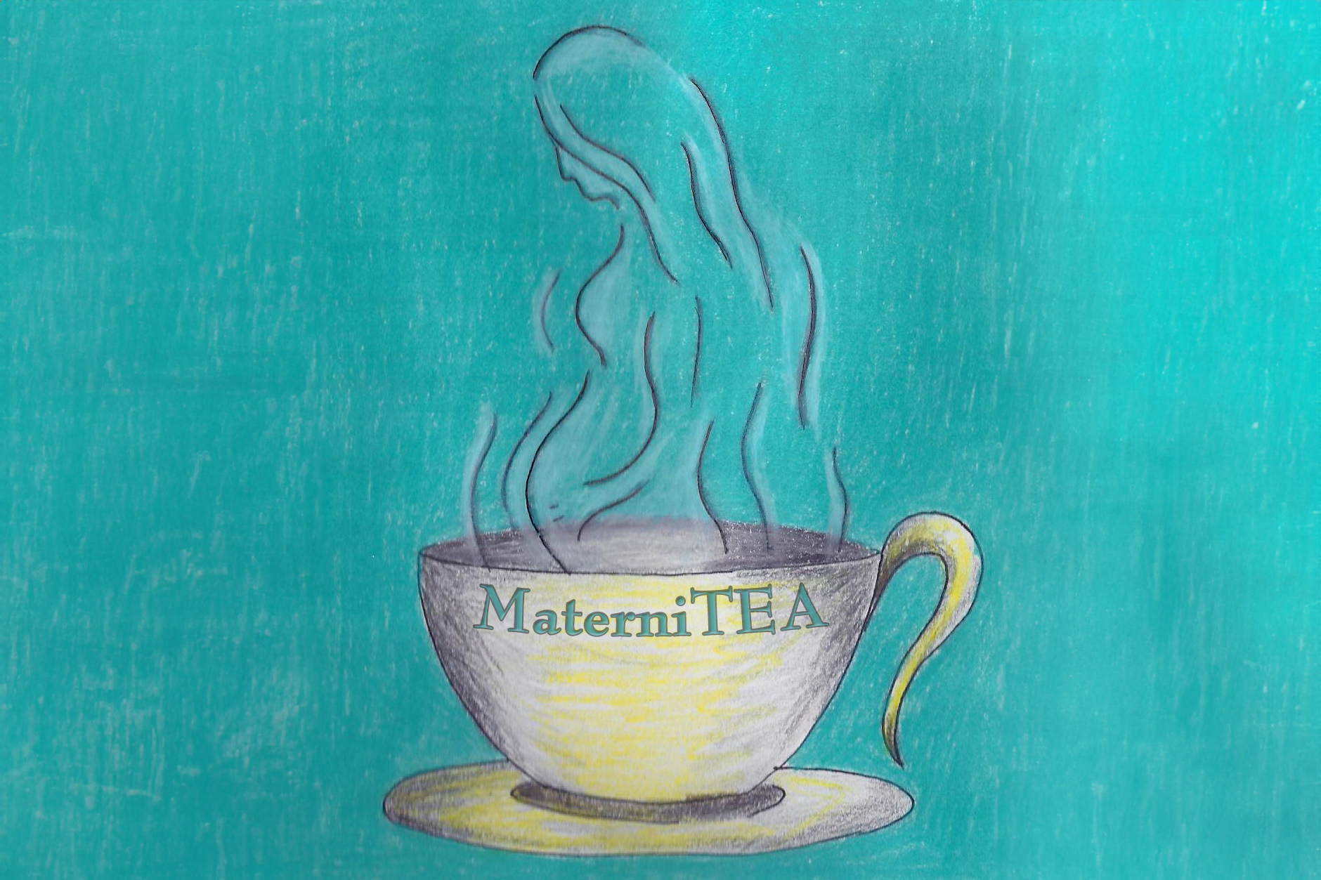
I am a tea lover, not an herbalist. Let me repeat that for emphasis: I am not an herbalist. I am not trained in the healing powers of herbs (and I believe that most of the claims about most of the herbs are horse-hockey, but that’s another story), but I know what people ask for at the tea bar. We seem to have a lot of pregnant women in town these days, and most of them come in requesting either ginger or mint for their morning sickness.
I did some reading, and found that most of the published studies agree that those are two herbs that settle the stomach well. I know ginger works for me. Doing a straight ginger-mint blend, however, tasted pretty wretched. I started monkeying around with combinations—carefully avoiding caffeine—and came up with MaterniTEA. It uses green rooibos, Egyptian chamomile, and honeybush as its base, along with the aforementioned organic peppermint and ginger. A touch of orange extract for flavor, and we have something that tastes good as well as helping with the nausea that triggered this whole thing.
The Logo
This logo was drawn by the lovely and talented Suzanna Bailey.In keeping with the philosophy I described in the last tea label post, I didn’t give Suzanna any specific instructions. I just described the tea and threw out a few adjectives like “soothing” and “relaxing,” and got out of her way. She came back with several pages of ideas and sketches, and one of them really caught my eye. My wife, Kathy, and I absolutely loved the look of the steam rising from a teacup in the shape of a pregnant woman.
Suzanna has an amazing eye for color, so she did all of the drawing and the coloring for this one—she just asked if I could fill in the lettering. Once again I am thrilled with the results and we’re having posters made of all of our custom tea logos.
Thank you, Suzanna!

Yet another new logo: Mr. Excellent’s Post-Apocalyptic Earl Grey

Such a delay! It was about eight months ago that I came up with the Mr. Excellent’s Post-Apocalyptic Earl Grey Tea blend (see my blog post about it here), and we finally have a logo for it! This one was drawn by my daughter’s friend from college, Brandon Pope.
I’ve found that logo art comes out better if I don’t tell the artist what I want, so I gave Brandon little more information than the name of the tea and what it is (an Earl Grey lapsang souchong). If I could draw, I probably would have done something with a dude sitting in the middle of a burned-out town, his shotgun at his side, drinking a cup of tea as the zombies eye him from a distance. In other words, something way too complex to use as a logo.
Brandon came up with the skull and gas mask, with one of the air filters replaced by a teacup. Very simple, yet immediately recognizable. His original was a hand-lettered pencil sketch (see below), which I needed to colorize. Brandon’s shading was great, especially where the texture of the paper showed, so I just added solid blocks of color behind the skull, mask, and teacup.
I really, really wanted to put this one on a black background, and I just couldn’t seem to make that work using his text. I re-did the text using a fun font called “Disgusting Behavior,” stretched vertically to achieve the look and aspect ratio that I was after. A blood-red color for the text with a subtle glow and an emboss effect finished it off perfectly.
For comparison, here is Brandon’s original pencil sketch (below) and the final logo (above). You can click on the final logo for a larger image.

This whole program of guest artists for tea logos (kicked off by Al Jones and his Hammer & Cremesickle logo) has been a blast. Thank you very much to Brandon for the artwork, and watch this space for guest logos by husband and wife team Doug and Suzanna Bailey, coming up soon.
Another new logo: Honey Mint Tea
![]() Back in October, my friend Al drew a logo for our Hammer & Cremesickle Red Tea blend. Today, he put his artistic talent back to work and came up with another logo for the Tea Bar. This time, it was for my caffeine-free “Honey Mint” blend.
Back in October, my friend Al drew a logo for our Hammer & Cremesickle Red Tea blend. Today, he put his artistic talent back to work and came up with another logo for the Tea Bar. This time, it was for my caffeine-free “Honey Mint” blend.
I developed this blend a few months ago when some customers had expressed an interest in a caffeine-free version of our Moroccan Mint tea. Not being a fan of decaffeinated teas, I went for a naturally caffeine-free base instead. I wanted it to be a little bit sweet, so I used honeybush as the base tea, and blended that with organic peppermint from Washington state. A little bit of licorice root for the aftertaste finishes off this sleepytime mint tea blend.
Al has a rather strange sense of humor (that’s why we get along, of course), and I gave him no guidelines at all on the logo. He set to work developing a logo based on a pun.
When I called the blend “Honey Mint,” I was referring to honeybush and peppermint. Al went after another meaning of mint, as in the United States mint. He drew a bee guarding a mint (a locked up hive full of peppermint and honey). Pretty tough-looking bee, too, with his cigarette, truncheon, and shades. The original drawing (see below) was just done with a pen and some printer paper. I scanned it in and colorized it using Photoshop. Hopefully, my colors fit Al’s original concept. I always feel strange about colorizing other people’s artwork — I’m afraid I’ll screw it up.
Another artist friend is currently working on a logo for Mr. Excellent’s Post-Apocalyptic Earl Grey, and we hope to find people to do my other house blends (Lady Grey and MaterniTea). As always, watch here for news.
Al’s original artwork for “Robson’s Honey Mint Tea.”
Hammer & Cremesickle Red
 Isn’t it fun how names develop for tea blends? The naming process is almost as much fun as the blending process itself.
For weeks, I had been trying to come up with a tea that invoked the taste of the creamsicles I used to enjoy so much as a kid (Who am I kidding? I still enjoy them!). Frozen orange over a vanilla bar. Yum! My initial attempts were based on black teas, and the flavor of the tea kept overwhelming the flavor of the orange and vanilla.
Finally, I hit on something that seemed to work. A blend of rooibos and honeybush as a base, which adds a rich, creamy texture. Orange and natural vanilla for the cremesicle flavor, and just a touch of carob to round everything out. I tried it both hot and iced and decided I liked it.
Some friends, Al and Ranetta, popped by the tea bar, and I asked if they’d like to sample my newest concoction. Being willing guinea pigs, they acquiesced. They tasted, we talked, and they liked it. Ranetta asked if she could buy a few ounces. As I started to write out the label, my hand stopped, poised to write, as I realized I hadn’t named the new blend yet.
I decided to write “orange creamsicle,” but Al was talking and distracting me (It’s all Al’s fault. Really it is). I misspelled the word. Unbelievable, isn’t it? But I threw an extra K in there. I noticed the error and commented on it.
“How did you spell it?” Al asked.
“Sickle with a K,” I replied. “As in ‘hammer and sickle’.”
It struck us both at about the same time that this is a red tea (the rooibos plant is also called the African redbush), so that could end up as a very fitting name. Al asked for a sheet of paper and set to work sketching a logo. I scanned, tweaked, and colorized his masterpiece (sorry, Al) and included it at the top of this blog post.
(Please imagine, in the following paragraph, that I’m speaking with the same accent as Mickey Rourke used when playing Whiplash in the second Iron Man movie. If you can’t do that, I’ll settle for Boris Badenov from the Rocky & Bullwinkle show.)
You must buy Hammer & Creamsickle Red now, comrade. Will take you back to childhood summers at family dacha on Volga river. Decadent treat from American capitalists. We have our own capitalism now; our own pravda. We have no money, but tea is cheap. Try now.
[UPDATE Feb 2012: We used this tea in the frosting for our Orange Spice Carrot Cake Muffins. It worked beautifully!]
[UPDATE Apr 2012: Al has drawn us another logo, this time for Robson’s Honey Mint Tea. He does great work.]
[UPDATE May 2012: Hammer & Cremesickle Red Tea is now available on our new Tea Bar website. I’ve updated the links in this article accordingly.]
